George Eastman Museum Logo Behind The Scenes
So often people look at the simplicity of a logo and they think “Well, that was easy.” But in all honesty, a ton of work goes into simple elegance. There is a finesse and talent to good typography and immaculate composition.
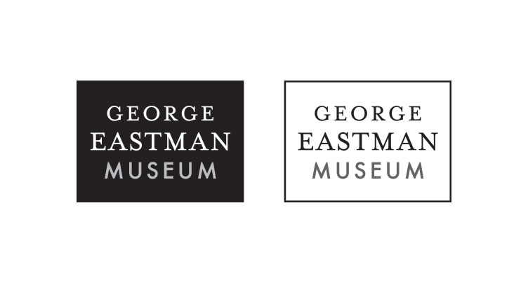
Here’s a little bit of the designer’s behind the scenes of the newest addition to our portfolio, the George Eastman Museum logo.
If you haven’t seen it yet, here it is in all it’s gorgeous simplicity and sophisticated typography. Every decision is made with reason.
TYPOGRAPHY
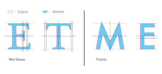
Since the typography is the dominant element in this logotype, let’s discuss this first. The base of the serif type is Mrs. Eaves and the base of the sans serif type is Futura. But these fonts when typed out in these words had significant flaws in spacing and structure that needed to be addressed. The “E” and the “T” of Mrs. Eaves were too narrow and too wide respectively and disrupted the consistent letter spacing in the word. So the arms of each of those letterforms were modified to address the space between that letter and its neighbor.
The “M” and the “E” of Futura each had a different problem. The peaks and valleys of the “M” were too pointy and that detail not only got lost as the logo was shrunk to a smaller size, but broke the strong baseline and X-height we were creating with the rest of the word. In short, we didn’t want this letter to rise above or sink below the rest of the word visually. Our goal was a strong, solid line of type.
While Futura is a very clean font, we wanted to give this logotype just a hint of modernism so we raised the middle arm of the “E” just a bit which completely changes the feel of that word.
The result is a juxtaposition of typographic styles that not only creates an interesting visual complement but pays homage to the history of the man’s legend while welcoming the growth of organization’s future.
THE FRAME

Put it in a black box and you’re done… right? Wrong. That black box needs to have meaning AND look good doing it. The negative space around the typography needs to anchor the type inside and the logo in the space it is sitting.
The concept behind using a frame is to allude to the media that the George Eastman Museum archives and displays… photography and film. Photos are framed and put on the wall and motion pictures are framed in the device that they are played on. A typical 8×10 ratio left too much room at the top and bottom of the logo. While the 3:4 ratio of a current film display was a little tighter, it was discussed how that has changed so much over the years and even today you can watch something in widescreen or standard display on your TV. So the notion was that this screen size was current, but not necessarily the forever standard and certainly not historically correct.
With that comment, we went back to what the film industry used when they first started producing motion pictures. Before sound or color was introduced and that is the aspect ratio that ended up working the best with the typographic solution that was created.
The solution is a frame that anchors the type in the logo and the logo in the space with significant historical meaning to the organization.
THE COMPETITION
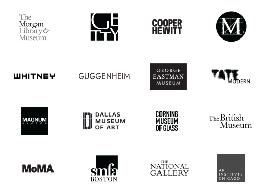
The ultimate test is how this logo stands up to the competition. With the upcoming marketing plan focusing on an international presence and the quality of the museum being comparable to that of the MoMA and the Whitney, we used those as benchmarks for the competitor analysis.
The result is a logo that stands its ground. It is bold, clearly read and is equal to, if not surpasses, the timelessness and austerity of other international museum logos.
So, the next time you see a very simple logo, know that if it is good, the design strategy behind it may be a little more complex.