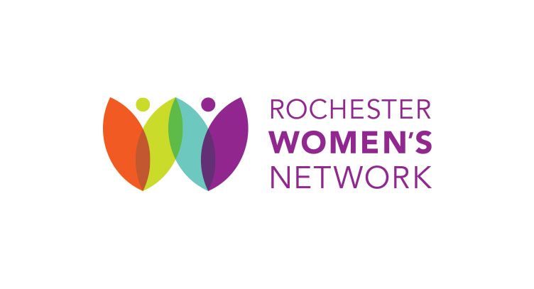
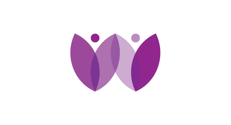
Rochester Women’s Network
ROCHESTER WOMEN’S NETWORK – LOGO DESIGN
Networking and Rochester go hand in hand. This organization has been around since 1978 and has always been rooted in their tagline “Connect. Succeed. Grow.” Our branding workshops helped them to discover their main messages in visual communications to evoke this message of a strong community of women supporting each other through all stages of their careers. The abstract representation of the icon represents a flower for “The Flower City,” a W for women, two people holding hands to show support, community and encouragement and a varied color palette to represent diversity.