BOPS

The Challenge:
Good Boy Organics needed design and marketing for their Baked Organic Potato Snack they that would stop the mom rushing through the organic snack aisle in her tracks and provide those in the chip aisle a certified organic, Non GMO Project Verified and gluten-free option.
Background Info:
Good Boy Organics had engaged another design team and got an option that they commented “they had seen before.” They were unimpressed and wanted options quickly… only 10 days until the package needed to go to print!
Design Direction:
– highest sales for potato chips are in the summer months for picnics and BBQ’s
– company’s core values are family and planet focused
– pop from the shelves with personality
– compete with other organic snacks
– compete with other potato chip snacks
– quality, taste, organic
– flexible across a variety of flavor skus
– kid friendly but not kid focused
The Solution:
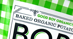
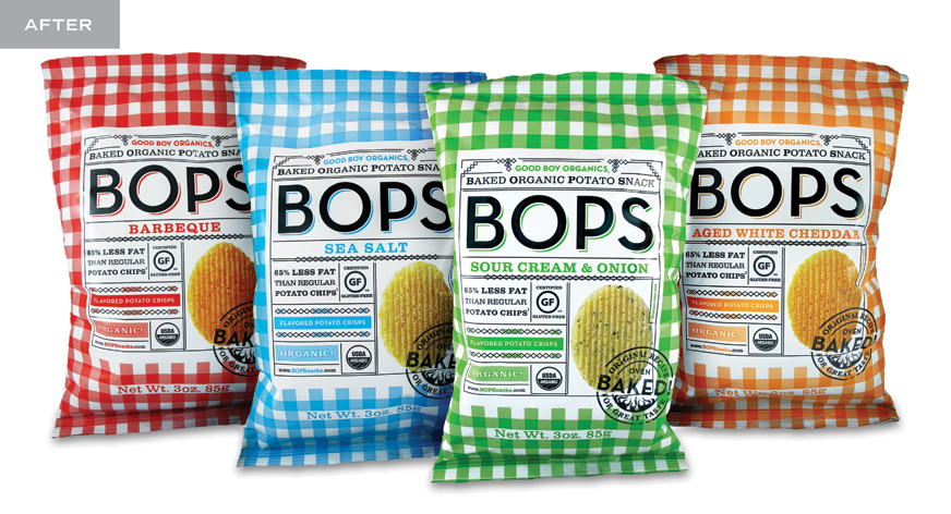
As a whole, the brand language speaks volumes about the quality and taste inside the package. It jumps from an aisle of serious, earthy, organic packaging with a nostalgia that any American can relate to, even if you’re not old enough to remember the time. As the brand evolves across the variety of flavors, the personality explodes with pop color indicators in an all-over gingham pattern. The information on the front of the bag is presented in a grid of information embellished with diamonds borrowed from cross-stitching patterns and a stamp of hot-rod flames declares that these snacks are different because they are oven-baked.
The Results:
Whole Foods introduced the product in their East Coast stores and quickly placed re-orders. BOPS can now be found at grocery stores and healthy eateries across the states.
Package design is more than just about telling people what’s inside; It’s about creating a brand, evoking emotion and compelling the audience to give it a try… which turns profit.