Summer Fancy Food Show Design Review
I spent Sunday, June 29th at the Summer Fancy Food Show at the Javits Center in NYC. My motive for attending was two-fold: to network, with potential partners and customers alike, and to be inspired.
Networking was amazing. Everyone I talked to was friendly and excited about their product or service. They were all willing to share information, contacts and referrals. And being in the melting pot that is NYC, I made friends with people I never would have otherwise.
The inspiration is what I really want to share. The show was split up into these categories–the domestic hall, the international hall and the new product hall. Splitting it up this way allows attendees to taste by state, country or new products to the show. My favorite aisle to go down was Mexico’s aisle. They were the best designed products, the most engaging presentations and all around most diverse in products and design.
WHY MEXICO?The culture was brought right into the show hall and showcased in every product that was represented. The overhead signage was colorful and well designed, there was a live mariachi band and everyone in the aisle was jovial and friendly. There was a fair amount of Tequila and margarita tasting, so that may have had something to do with it… it was a fun aisle.
Here is the branding for the Mexican Trade Organization – Gorgeous, communicative and fun.

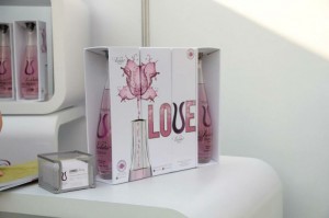
This tequila was great too. The branding, the packaging, the bottle… all works together to be a high end feminine party liqour. It also tasted great and made an incredible watermelon margarita.
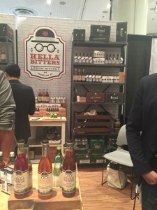
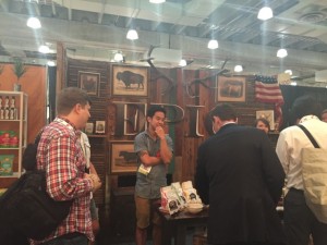
BEST BOOTHS
Every booth was so different from one other. Some were simply a tasting table, but others, and the most successful ones, were experiencial spaces that were memorable and had branding and packaging that you would pick up on a retail shelf simply because it looks good. Some looked like country kitchens, some had backyard fences and gates, others could have been mistaken for an old school apothecary. I could write a novel about the ones I loved, but here are just a few of my favorites. Simple. Inviting. Well-branded.
Hella Bitters Epic Snacks

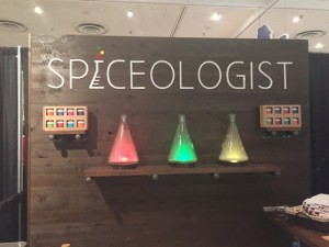
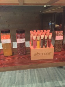
Spiceologist
GRANOLA & CHOCOLATE
I looked at endless amounts of granola and chocolate. I was there with a new client (TBA) that walks the line between the organic granola category and the chocolate confection category – so I looked at and happily tasted a ton of granola and chocolate products.
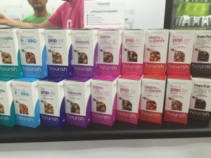
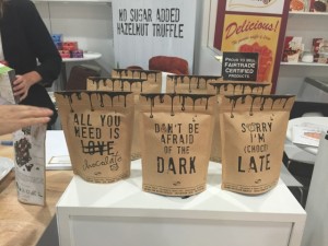
Nourish
I fell in love with this product design. It is so well done on so many levels. It showcases the ingredients and product; it has very strong, smart branding; the poppy color variety is beautiful and communicates the different flavors clearly; the typography is simply gorgeous; the names are fun and memorable. As a family of products – and furthermore as a brand, these products absolutely know what’s up. The visual language speaks volumes about the brand. Kudos to the designer.
And I wasn’t able to remember or figure out from my photo the brand of chocolate that this packaging came from, but I think it is simple and smart. I believe this was a Belgian company which is why I am having a hard time locating the product.
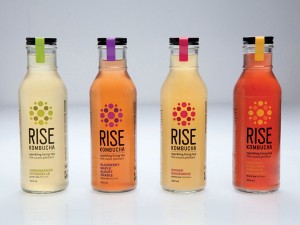
WHAT’S HOT? – KOMBUCHA
Every year there is a new trend. Kombucha was this year’s fab new product all over the place.The designs are fun, bold and indicative of the product’s ancient ancestry in Eastern Asia. Here are some of my favorites.