The X-Files Case #: ROG103
There is so much work that goes into projects that never see the light of day. Here at the A3 Design Blog, we are going to start sharing some of that work in a quest to enlighten our fans on the creative process with our 2016 blog series: The X-Files.
If you haven’t seen some of our most recently released work, please take a peek at REACH Organics
logo, branding and package design for a healthy, decadent snack
The final brand is inspired by sailing with an aire of luxury and quality. The 74% cacao covered cubes are intended to be a nutrient rich alternative to the high-end artisan chocolates most give as gifts or hide away in their desk. Printing the box with a touchè laminate to contrast the gold foil emboss was a smart choice for the shopper looking for a unique experience in their gifting. Our clever branding which mimics the stenciled typography on sailing docks and uses a sailor’s knot to anchor the design (pun intended) is not too feminine in its style yet luxurious enough to compete with a $20 box of truffles.
We spend much time with the client to get to know their product and their vision for the brand. We work through discovery sessions to identify the product’s story, message and relevance. We profile the perfect audience and work to speak directly to their lifestyle while staying true to the client’s personality and visual preferences.
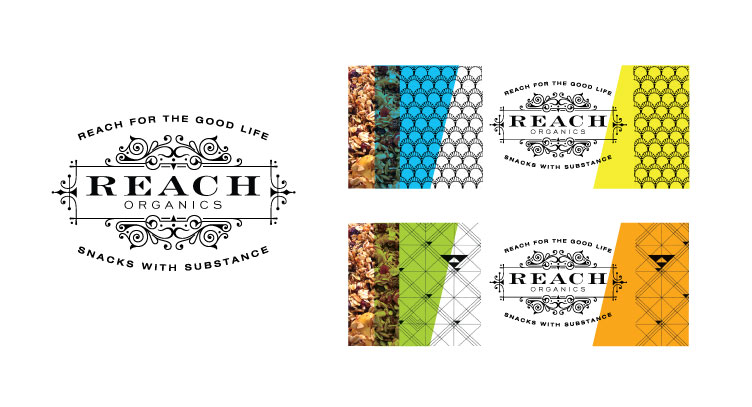
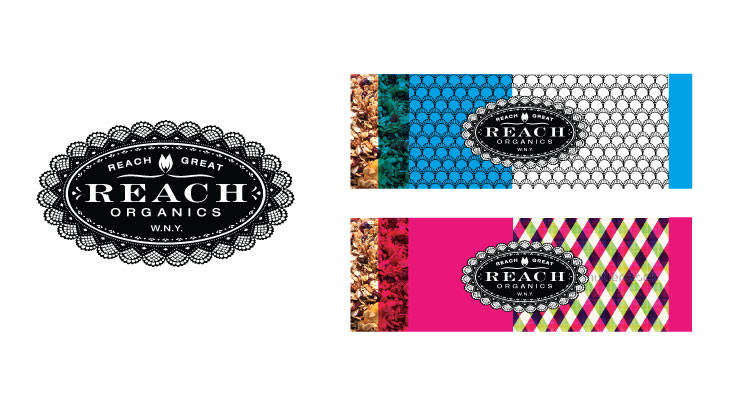
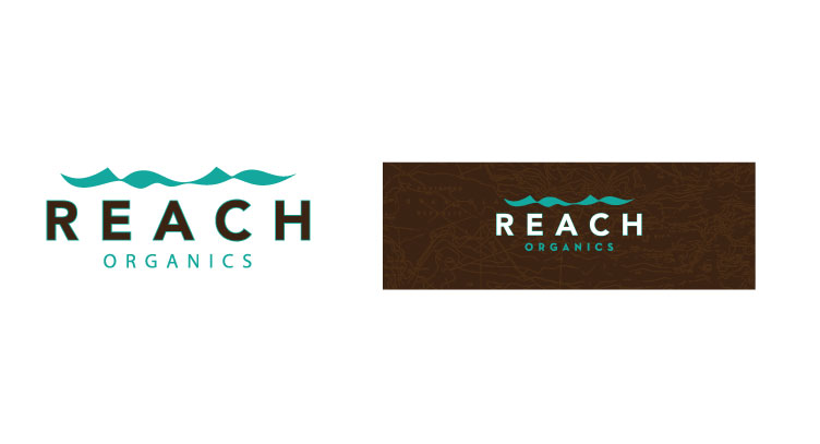
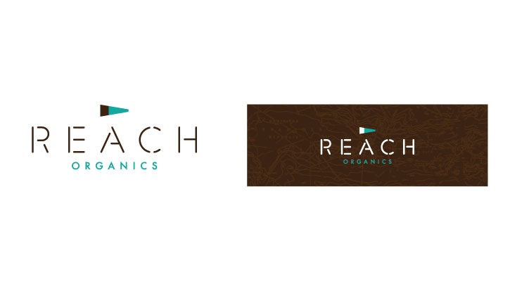
We were given notes of inspiration that embodied the intricate lavish designs of mosaic works of art, moorish tiles, hollywood recency, and art deco. We weren’t entirely sure what the form of the package was going to be, but for the purpose of presentation, we worked with a bar-like form to provide a notion of what the package could look like stylistically.
Here are the options that were presented:
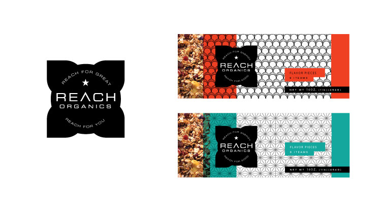
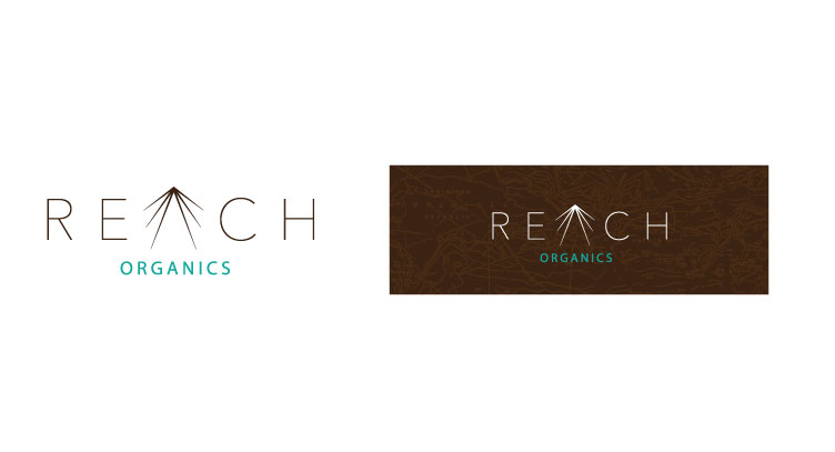
As with many products that engage us earlier in their development, the specs changed as her product evolved. After reviewing the results of our discovery sessions and continuing to research the market for her product, she decided that a less cluttered approach to the design was necessary and that the brand needed to better tell the story of the product origin in sailing. We also discussed the need for the brand to be more androgynous so that a man wouldn’t be put off by giving or receiving such a gift. We now knew that the product was taking the form of 1 inch cubes and would be sold in packs of 3 and 9.
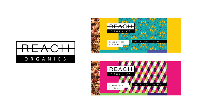
With this direction, the following options were presented:
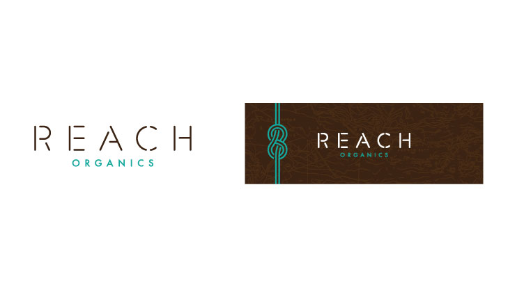
The last option you see here is ultimately the option that was chosen and refined for use as the REACH Organics brand. It is exciting to see a brand evolve from the original presentation to a living, breathing system of communications that tell the story of the product. Look for more from REACH as we continue to expand her product offering and communications.