Bagby Lighting & Juice Design
LOGO DESIGNS, MARKETING & OFFICE SPACE DESIGN –
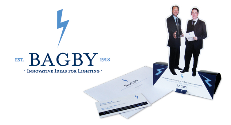
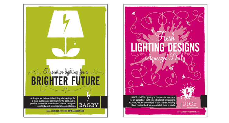
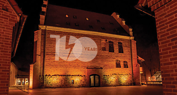
A company that has been in business almost as long as electricity has been around needed new light shed on its tired branding and design. A logo and brand language was created to position the long time lighting agency as one of innovation and growth. The ambiguity of the bolt says electricity without pigeon holing the company into a service or product.
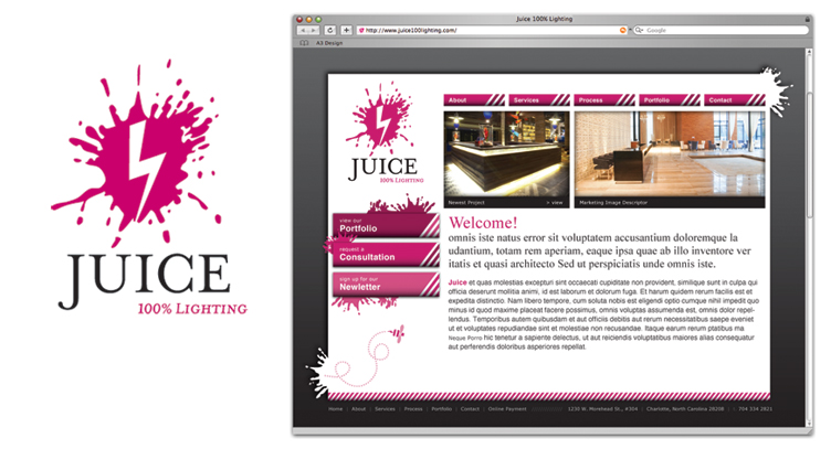
When it came time to introduce their sister company, “Juice”, they wanted to leverage the Bagby brand and appeal to the more creative side of the industry with their target being interior designers and architects. By using the same type treatment and the lightning bolt the brands are closely associated. The splat is a visual take on the phrase “creative juices” and the name “Juice” also implies electricity or power.