RG&E Rebrands
Our local power company recently underwent a rebrand. It allows for growth in new sources of energy. It is very relevant and necessary in today’s market, but is it timeless or trendy?
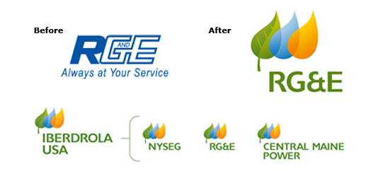
“We took the best attributes from our local NYSEG and RG&E brands (familiarity, trust, safety, reliability and outstanding customer service) and combined them with the best attributes of our global Iberdrola brand (innovation, leadership in renewables, caring and environmental responsibility) to create a new identity that is more than the sum of its parts,” said Mark S. Lynch, president of NYSEG and RG&E.”
“The new logos were inspired by nature,” Lynch said. “The leaf in the logo represents respect for the environment. The blue and orange drops represent sources of energy used by Iberdrola to generate electricity around the globe – blue for wind and water, orange for natural gas and the sun.”
“The changes to the logos create a visual link to our parent company, Iberdrola – one of the top energy companies in the world,” Lynch said. “What hasn’t changed is our dedication to serving our customers: we’re the same people delivering the same safe, reliable service.”
Check out the whole story HERE.